


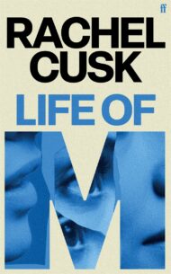


















Cover Design:
Tania Branigan’s Red Memory
14 February 2023
Tania Branigan’s Red Memory explores the Cultural Revolution and how it shapes China today. It uncovers forty years of silence through the rarely heard stories of individuals who lived through Mao’s decade of madness.
In this article Jonny Pelham, art director of the hardback cover for Red Memory, discusses its creation with designer Tom Etherington.

Jonny: Thanks so much for taking the time to talk to us, Tom. I was thrilled when you accepted the brief for this book. Your designs have a clarity of vision, but there’s always something surprising or hidden in there too. A perfect combination for a book of secret histories.
Would you mind telling us a little bit about the portrait on the front cover [pictured]? The first time I saw it, I thought the JPG had become glitched, or maybe the streaks were because the photograph had got damaged in storage. As I looked more closely, though, I discovered my assumptions were wrong.
Tom: Xu Weixin is a brilliant Chinese contemporary artist. His paintings address the cultural narrative of China and often include portraiture of ordinary people rather than political leaders or historical figures. Traditional Chinese art has vertical scripts running alongside the painting with information on the painting and artwork, but Xu Weixin uses horizontal scripts that run directly through the painting, with biographical information on the person in the portrait. The way that these scripts obfuscate the portrait feels pertinent for a book about such a chaotic, manipulative period of history.
A portrait from the work ‘Chinese Historical Figures: 1966–1976’ © Weixin Xu.
Red Memory seeks to explain historical, political and sociological phenomena through the lens of individual experiences. And the Cultural Revolution is a topic that most Westerners don’t really understand – as Tania Branigan points out, Michael Gove thought it just meant something like a sudden aesthetic shift rather than a violent humiliation and execution of those deemed ‘counter-revolutionary’. When you’re designing, are you holding thoughts like these in your head? Are you trying to hit a specific tone? Or put another way, what are the difficulties and joys of designing a cover for a book about complex and highly emotive issues that may not be well understood by most?
The first thing that comes into my head when I think of the Cultural Revolution is black-and-white photography, crowds of people in uniforms, Tiananmen Square; but what Branigan does so well is to tell the human, personal stories. I think black-and-white, overtly historical photography can distance people emotionally from a subject, whereas portraiture is immediately engaging. It was a devastating period of history for young people in China, so to show an intimate portrait of a young person instead of an archival historical photo felt like an appropriate choice for the cover.
From a designer’s standpoint, I love the typeface you’ve used here. I have some of my own reasons for liking it and thinking it feels appropriate, but I’d be really interested to hear how the process worked for you.
It might be a very ‘designer’ thing to say, but I think typefaces are as expressive tonally as images: the right typeface can evoke a very specific feeling in a design.
Book covers are sometimes guilty of hamming it up with books about communism and China; I didn’t want the cover to parody Chinese propaganda from the time. I hope the type makes this book look like the important, eloquent, at times brutal account that it is.
In your research for this cover, you turned up a lot of extremely haunting and powerful photographs. How did the image research for this project compare to other books you’ve worked on? And when you were cropping and treating these images, did it feel different from handling stock, studio, still life, or self-generated imagery?
The Cultural Revolution is still seen as a taboo subject in China, so it was actually quite hard to find artists whose work responds to it. Xu Weixin is featured in the book, and through researching him I came across a book called The Chinese Art Book, published by Phaidon, which introduced me to the work of artists like He Duoling and Li Songsong.
Another resource I found was the Beijing Silvermine, an online archive by Thomas Sauvin, who collected discarded photographic negatives from a recycling plant in Beijing and developed over 850,000 photographs. There are some beautiful, ethereal photos of everyday life in the collection: abandoned, anonymous family portraits, ghost-like with damage and fading on the negatives. I looked at using some of these images for the cover, but felt a responsibility to use them respectfully. These are real, private photos from real people’s lives.
Watch Tania Branigan reading from Red Memory

Read more Book Cover Design articles from the Faber Journal.
Buy the Book

An indelible exploration of the Cultural Revolution and how it shapes China today, Red Memory uncovers forty years of silence through the rarely heard stories of individuals who lived through Mao’s decade of madness.
About the Author
Tania Branigan is the Guardian foreign leader writer; she spent seven years as the Guardian’s China correspondent. Her writing has also appeared in the Washington Post and the Australian. Red Memory is her first book.
About the Author
